How to Deal with Predicting Targets Bound Between \(a\) and \(b\)
Purpose
When dealing with predictive modelling, the target variable is sometimes bound within a specific range, such as probabilities which are confined between 0 and 1. Here, we will explore different approaches to handle such cases.
Note
While the argument presented here alternates between discussing target boundaries as \([a,b]\) and \([0,1]\), the key takeaway is that the target variable is bounded. Converting from one set of boundaries to another, such as from \([a,b]\) to \([0,1]\), should be a straightforward linear transformation.
Approach 1: Post-Processing the Output
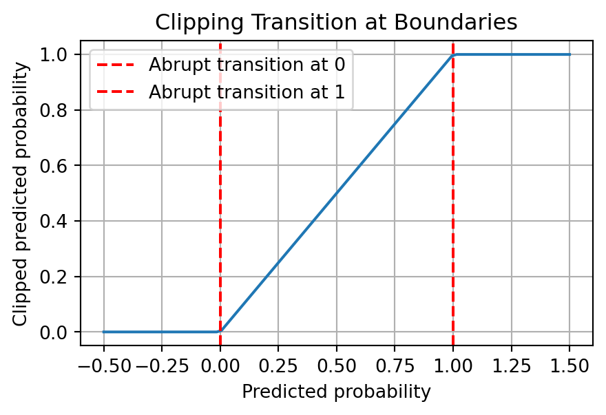
The simplest approach is to clip the predicted values to be within the range \([a, b]\).
Issue
Although this is the easiest to implement, the transition is not smooth. This can be problematic if the model being trained relies on gradients. For example, if you are using gradient descent to train the model, the gradient will be 0 for all values outside the range \([a, b]\). This can lead to the model not being able to learn the correct parameters.
Code
import numpy as npimport matplotlib.pyplot as pltdef clip_prob(p):return np.clip(p, 0, 1)# Simulated predicted probabilitiespredicted_probs = np.linspace(-0.5, 1.5, 100)# Clipped probabilitiesclipped_probs = clip_prob(predicted_probs)plt.figure(figsize=(5, 3))plt.plot(predicted_probs, clipped_probs)plt.xlabel('Predicted probability')plt.ylabel('Clipped predicted probability')plt.title('Clipping Transition at Boundaries')plt.grid(True)plt.axvline(x=0, color='red', linestyle='--', label="Abrupt transition at 0")plt.axvline(x=1, color='red', linestyle='--', label="Abrupt transition at 1")plt.legend()plt.show()
In the above plot, you can see that the function abruptly changes at 0 and 1. While the function is not discontinuous, these abrupt transitions can be problematic.
Approach 2: Pre-Processing the Output
Instead of post-processing, you can pre-process the target variable and then undo this pre-processing on the predicted values.
Clip the target slightly above 0 and below 1, i.e. \([0, 1]\) becomes \([\epsilon, 1 - \epsilon]\) then convert it to log odds. Train the model on these log odds and apply the sigmoid function to the predictions to revert them to probabilities.
Issue
The tiny number, \(\epsilon\), used for clipping is essentially a “magic number”. It is not clear how to choose this number, and it is not clear how to interpret the model parameters.
In this example, we use two \(\epsilon\) values, \(10^{-5}\) and \(10^{-2}\), to clip the probabilities before converting them to log-odds. As you can see from the plots, the choice of \(\epsilon\) can significantly impact the predicted probabilities; the prediction with a smaller \(\epsilon\) value is closer to the actual probabilities, while the one with a larger \(\epsilon\) deviates more. Although we can always choose the most negligible possible \(\epsilon\), this illustrates the sensitivity of the log-odds transformation approach to the choice of \(\epsilon\), which can be considered a magic number in this context.
Regularise the target variable using a Beta distribution. This approach uses parameters \(\alpha\) and \(\beta\), which are based on the mean and variance of the target variable.
The regularised probabilities are defined as: \[p_\mathrm{regularised} = (\alpha + y) / (\alpha + \beta + 1)\]
where \(y\) is the target (probability), \(\alpha\) and \(\beta\) are the parameters of the Beta distribution. The parameters can be interpreted as the number of successes and failures, respectively. The regularised probabilities are the posterior mean of the Beta distribution, with the prior being a uniform distribution. The Beta distribution parameters are defined as: \[\alpha = \bar{p}\left(\frac{\bar{p} (1 - \bar{p})}{\sigma^2} - 1\right) \]\[\beta = (1 - \bar{p})\left(\frac{\bar{p} (1 - \bar{p})}{\sigma^2} - 1\right) \]
where \(\bar{p}\) and \(\sigma^2\) are respectively the sample mean and the variance of the target variable.
Advantage
No magic numbers are involved, making the process interpretable. The regularised probabilities are always within the range \([0, 1]\), and the transition is smooth.
Code
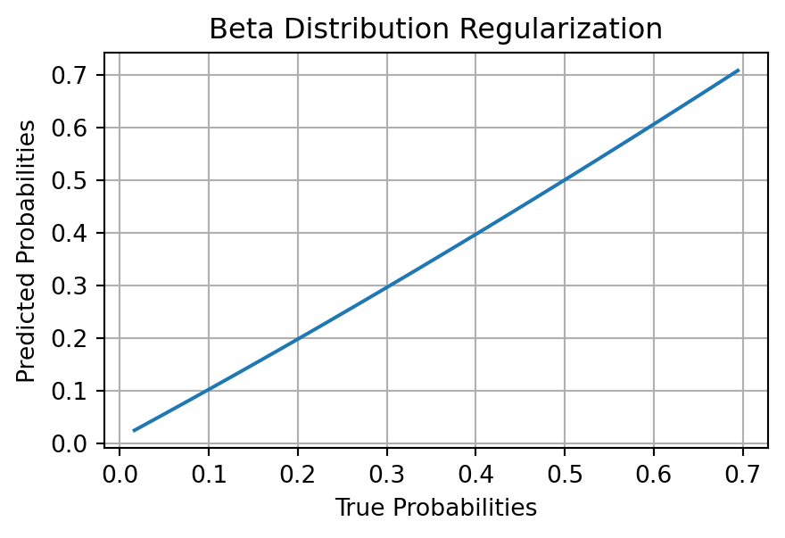
import numpy as npimport matplotlib.pyplot as pltfrom sklearn.linear_model import LinearRegression# Simulated probabilitiesnp.random.random(69)y_prob = np.random.beta(2, 5, 100)def estimate_alpha_beta(mean, var): common_term = mean * (1- mean) / var -1 alpha_est = mean * common_term beta_est = (1- mean) * common_termreturn alpha_est, beta_estdef regularize_prob(p, alpha, beta):return (alpha + p) / (alpha + beta +1)def logit(p):return np.log(p / (1- p))# Calculate alpha and betamean = np.mean(y_prob)var = np.var(y_prob)alpha_est, beta_est = estimate_alpha_beta(mean, var)# Regularize and convert to log-oddsy_regularized = regularize_prob(y_prob, alpha_est, beta_est)y_logit = logit(y_regularized)# Fit a linear modelmodel = LinearRegression()model.fit(y_prob.reshape(-1,1), y_logit)# Predicty_pred_logit = model.predict(y_prob.reshape(-1,1))y_pred_regularized = sigmoid(y_pred_logit)# Convert back to original scaley_pred_prob = (y_pred_regularized * (alpha_est + beta_est +1) - alpha_est)plt.figure(figsize=(5, 3))argsort = np.argsort(y_prob)plt.plot(y_prob[argsort], y_pred_prob[argsort])plt.xlabel('True Probabilities')plt.ylabel('Predicted Probabilities')plt.title('Beta Distribution Regularization')plt.grid(True)plt.show()
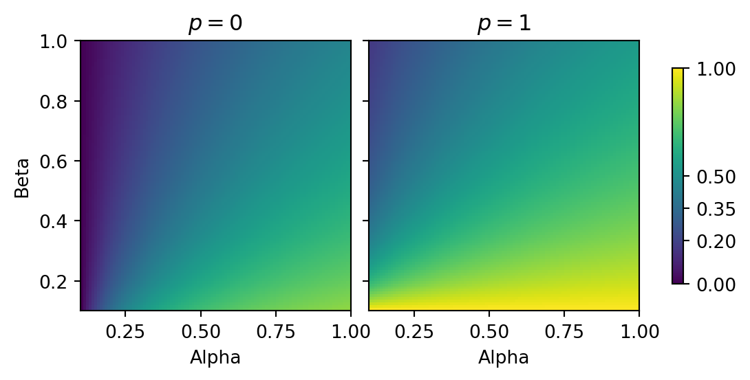
Additional visualisation for \(\alpha\) and \(\beta\)
We will create a 2D histogram where the x-axis represents \(\alpha\), the y-axis represents \(\beta\), and the colour represents the regularised probability. We will do this for probabilities close to \(0\) and \(1\).
Code
import numpy as npimport matplotlib.pyplot as pltdef regularize_prob(p, alpha, beta):return (alpha + p) / (alpha + beta +1)# Define the range of values for alpha, beta, and palpha_values = np.linspace(0, 5, 100)beta_values = np.linspace(0, 5, 100)# regularise extreme probabilitiesregularized_prob_0 = np.array([[regularize_prob(0, alpha, beta) for alpha in alpha_values] for beta in beta_values])regularized_prob_1 = np.array([[regularize_prob(1, alpha, beta) for alpha in alpha_values] for beta in beta_values])fig, axs = plt.subplots(1, 2, figsize=(7, 3), sharey=True)# Calculate the minimum and maximum values of the regularized probabilityvmin =min(np.min(regularized_prob_0), np.min(regularized_prob_1))vmax =max(np.max(regularized_prob_0), np.max(regularized_prob_1))# Create the subplots and colorbarc0 = axs[0].imshow(regularized_prob_0, cmap='viridis', origin='lower', extent=[0.1, 1, 0.1, 1], vmin=vmin, vmax=vmax)axs[0].set_title("$p = 0$")axs[0].set_xlabel('Alpha')axs[0].set_ylabel('Beta')c1 = axs[1].imshow(regularized_prob_1, cmap='viridis', origin='lower', extent=[0.1, 1, 0.1, 1], vmin=vmin, vmax=vmax)axs[1].set_title("$p = 1$")axs[1].set_xlabel('Alpha')fig.colorbar(c1, location ="right", shrink=0.8, ticks=[vmin, 0.2, 0.35, 0.5, vmax], format="%.2f")plt.subplots_adjust(wspace=-1)plt.tight_layout()plt.show()
Interpretation
For \(p = 0\): As \(\alpha\) and \(\beta\) increase, the regularised probability moves away from 0. This is expected as higher \(\alpha\) and \(\beta\) values pull the probability towards the mean of the Beta distribution.
For \(p = 1\): Similar to \(p = 0\) case, higher \(\alpha\) and \(\beta\) values pull the probability towards the mean of the Beta distribution.
Intuition around the \(\beta\) distribution
The Beta distribution is a conjugate prior for the Bernoulli distribution. This means that if the prior distribution is a Beta distribution, the posterior distribution will also be a Beta distribution. This is useful as it allows us to easily calculate the posterior distribution of the parameters of the Bernoulli distribution. In this case, the parameters of the Bernoulli distribution are the probability of success and the probability of failure, which are \(\alpha\) and \(\beta\), respectively.
In the context of the \(\beta\) distribution, very high values of \(\alpha\) and \(\beta\) correspond to a very narrow distribution, while very low values of \(\alpha\) and \(\beta\) correspond to a very wide distribution. This is because the variance of the \(\beta\) distribution is \(\frac{\alpha \beta}{(\alpha + \beta)^2 (\alpha + \beta + 1)}\). As \(\alpha\) and \(\beta\) increase, the variance decreases, and the distribution becomes narrower. As \(\alpha\) and \(\beta\) decrease, the variance increases, and the distribution becomes wider.
In practical terms, high values of \(\alpha\) and \(\beta\) would imply that you have a high level of confidence that the probabilities are close ot the mean.